
# 快速入门
基础配置条件
- Nuget安装Avalonia
- Nuget安装AtomUI
基础用法
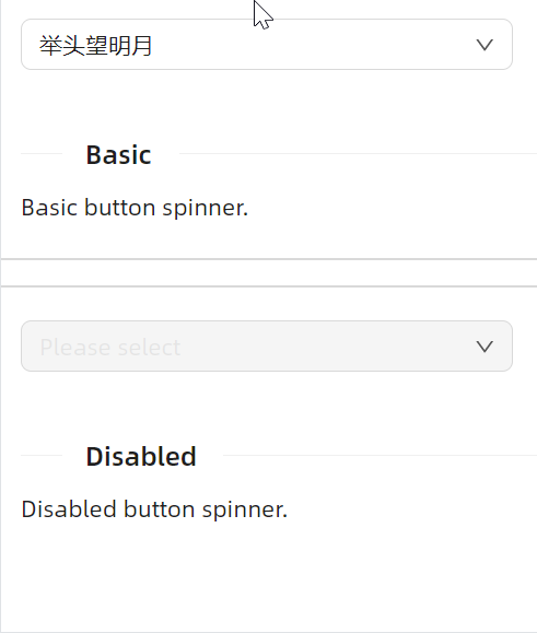
一眼就懂的使用方式。
<atom:ComboBox PlaceholderText="Please select" Width="300">
    <atom:ComboBoxItem>床前明月光</atom:ComboBoxItem>
    <atom:ComboBoxItem>疑是地上霜</atom:ComboBoxItem>
    <atom:ComboBoxItem>举头望明月</atom:ComboBoxItem>
    <atom:ComboBoxItem>低头思故乡</atom:ComboBoxItem>
    <atom:ComboBoxItem>床前明月光</atom:ComboBoxItem>
    <atom:ComboBoxItem>疑是地上霜</atom:ComboBoxItem>
    <atom:ComboBoxItem>举头望明月</atom:ComboBoxItem>
    <atom:ComboBoxItem>低头思故乡</atom:ComboBoxItem>
    <atom:ComboBoxItem>床前明月光</atom:ComboBoxItem>
    <atom:ComboBoxItem>疑是地上霜</atom:ComboBoxItem>
    <atom:ComboBoxItem>举头望明月</atom:ComboBoxItem>
    <atom:ComboBoxItem>低头思故乡</atom:ComboBoxItem>
    <atom:ComboBoxItem>床前明月光</atom:ComboBoxItem>
    <atom:ComboBoxItem>疑是地上霜</atom:ComboBoxItem>
    <atom:ComboBoxItem>举头望明月</atom:ComboBoxItem>
    <atom:ComboBoxItem>低头思故乡</atom:ComboBoxItem>
    <atom:ComboBoxItem>床前明月光</atom:ComboBoxItem>
    <atom:ComboBoxItem>疑是地上霜</atom:ComboBoxItem>
    <atom:ComboBoxItem>举头望明月</atom:ComboBoxItem>
    <atom:ComboBoxItem>低头思故乡</atom:ComboBoxItem>
    <atom:ComboBoxItem>床前明月光</atom:ComboBoxItem>
    <atom:ComboBoxItem>疑是地上霜</atom:ComboBoxItem>
    <atom:ComboBoxItem>举头望明月</atom:ComboBoxItem>
    <atom:ComboBoxItem>低头思故乡</atom:ComboBoxItem>
    <atom:ComboBoxItem>床前明月光</atom:ComboBoxItem>
    <atom:ComboBoxItem>疑是地上霜</atom:ComboBoxItem>
    <atom:ComboBoxItem>举头望明月</atom:ComboBoxItem>
    <atom:ComboBoxItem>低头思故乡</atom:ComboBoxItem>
    <atom:ComboBoxItem>床前明月光</atom:ComboBoxItem>
    <atom:ComboBoxItem>疑是地上霜</atom:ComboBoxItem>
    <atom:ComboBoxItem>举头望明月</atom:ComboBoxItem>
    <atom:ComboBoxItem>低头思故乡</atom:ComboBoxItem>
    <atom:ComboBoxItem>床前明月光</atom:ComboBoxItem>
    <atom:ComboBoxItem>疑是地上霜</atom:ComboBoxItem>
    <atom:ComboBoxItem>举头望明月</atom:ComboBoxItem>
    <atom:ComboBoxItem>低头思故乡</atom:ComboBoxItem>
    <atom:ComboBoxItem>床前明月光</atom:ComboBoxItem>
    <atom:ComboBoxItem>疑是地上霜</atom:ComboBoxItem>
    <atom:ComboBoxItem>举头望明月</atom:ComboBoxItem>
    <atom:ComboBoxItem>低头思故乡</atom:ComboBoxItem>
</atom:ComboBox>
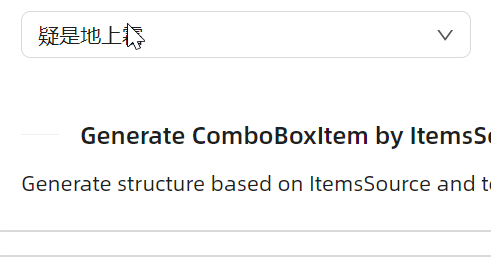
ItemsSource
正常来说,这种 ItemsSource 方式才是最常见的使用方式。
这本质上是 Avalonia 中的典型用法,先通过 ItemsSource 绑定数据来源,再通过 ItemTemplate 绑定数据项的显示方式。
<atom:ComboBox PlaceholderText="Please select" Width="300"
               x:DataType="viewModels:ComboBoxViewModel"
               ItemsSource="{Binding ComboBoxItems}">
    <atom:ComboBox.ItemTemplate>
        <DataTemplate>
            <atom:TextBlock Text="{Binding Text}" VerticalAlignment="Center"/>
        </DataTemplate>
    </atom:ComboBox.ItemTemplate>
</atom:ComboBox>
禁用
一眼就懂的 IsEnabled 属性。
<atom:ComboBox PlaceholderText="Please select" Width="300" IsEnabled="False">
    <atom:ComboBoxItem>床前明月光</atom:ComboBoxItem>
    <atom:ComboBoxItem>疑是地上霜</atom:ComboBoxItem>
    <atom:ComboBoxItem>举头望明月</atom:ComboBoxItem>
    <atom:ComboBoxItem>低头思故乡</atom:ComboBoxItem>
</atom:ComboBox>
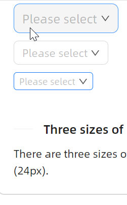
大小尺寸
SizeType 属性可选值有Large、Middle、Small三个。
<StackPanel Orientation="Vertical" Spacing="10" Margin="0, 0, 20, 0">
    <atom:ComboBox SizeType="Large" PlaceholderText="Please select">
        <atom:ComboBoxItem>床前明月光</atom:ComboBoxItem>
        <atom:ComboBoxItem>疑是地上霜</atom:ComboBoxItem>
        <atom:ComboBoxItem>举头望明月</atom:ComboBoxItem>
        <atom:ComboBoxItem>低头思故乡</atom:ComboBoxItem>
    </atom:ComboBox>
    <atom:ComboBox SizeType="Middle" PlaceholderText="Please select">
        <atom:ComboBoxItem>床前明月光</atom:ComboBoxItem>
        <atom:ComboBoxItem>疑是地上霜</atom:ComboBoxItem>
        <atom:ComboBoxItem>举头望明月</atom:ComboBoxItem>
        <atom:ComboBoxItem>低头思故乡</atom:ComboBoxItem>
    </atom:ComboBox>
    <atom:ComboBox SizeType="Small" PlaceholderText="Please select">
        <atom:ComboBoxItem>床前明月光</atom:ComboBoxItem>
        <atom:ComboBoxItem>疑是地上霜</atom:ComboBoxItem>
        <atom:ComboBoxItem>举头望明月</atom:ComboBoxItem>
        <atom:ComboBoxItem>低头思故乡</atom:ComboBoxItem>
    </atom:ComboBox>
</StackPanel>
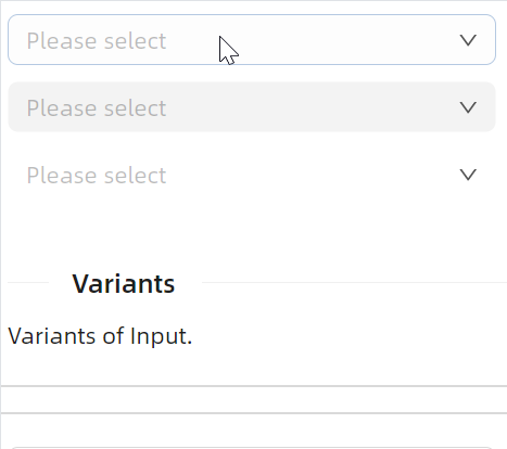
多种变体
变体的作用在于更好的融于不同的UI设计风格,是视觉方向的属性。其属性名为 StyleVariant,可选值有Outline、Filled、Borderless。
<StackPanel Orientation="Vertical" Spacing="10">
    <atom:ComboBox StyleVariant="Outline" PlaceholderText="Please select" Width="300">
        <atom:ComboBoxItem>床前明月光</atom:ComboBoxItem>
        <atom:ComboBoxItem>疑是地上霜</atom:ComboBoxItem>
        <atom:ComboBoxItem>举头望明月</atom:ComboBoxItem>
        <atom:ComboBoxItem>低头思故乡</atom:ComboBoxItem>
    </atom:ComboBox>

    <atom:ComboBox StyleVariant="Filled" PlaceholderText="Please select" Width="300">
        <atom:ComboBoxItem>床前明月光</atom:ComboBoxItem>
        <atom:ComboBoxItem>疑是地上霜</atom:ComboBoxItem>
        <atom:ComboBoxItem>举头望明月</atom:ComboBoxItem>
        <atom:ComboBoxItem>低头思故乡</atom:ComboBoxItem>
    </atom:ComboBox>

    <atom:ComboBox StyleVariant="Borderless" PlaceholderText="Please select" Width="300">
        <atom:ComboBoxItem>床前明月光</atom:ComboBoxItem>
        <atom:ComboBoxItem>疑是地上霜</atom:ComboBoxItem>
        <atom:ComboBoxItem>举头望明月</atom:ComboBoxItem>
        <atom:ComboBoxItem>低头思故乡</atom:ComboBoxItem>
    </atom:ComboBox>
</StackPanel>
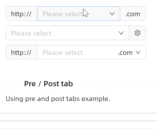
Pre/Post tab
有时候需要在输入框的左侧或者右侧添加一些内容,这时就可以使用 LeftAddOn 和 RightAddOn 属性。
LeftAddOn表示输入框左侧位置的Pre Tab,其值可以是一个图标,也可以是字符串。RightAddOn表示输入框右侧位置的Pre Tab,其值可以是一个图标,也可以是字符串。
<StackPanel Orientation="Vertical" Spacing="10">
    <atom:ComboBox PlaceholderText="Please select" Width="300"
                   LeftAddOn="http://"
                   RightAddOn=".com">
        <atom:ComboBoxItem>床前明月光</atom:ComboBoxItem>
        <atom:ComboBoxItem>疑是地上霜</atom:ComboBoxItem>
        <atom:ComboBoxItem>举头望明月</atom:ComboBoxItem>
        <atom:ComboBoxItem>低头思故乡</atom:ComboBoxItem>
    </atom:ComboBox>

    <atom:ComboBox PlaceholderText="Please select" Width="300"
                   RightAddOn="{atom:IconProvider Kind=SettingOutlined}">
        <atom:ComboBoxItem>床前明月光</atom:ComboBoxItem>
        <atom:ComboBoxItem>疑是地上霜</atom:ComboBoxItem>
        <atom:ComboBoxItem>举头望明月</atom:ComboBoxItem>
        <atom:ComboBoxItem>低头思故乡</atom:ComboBoxItem>
    </atom:ComboBox>

    <atom:ComboBox PlaceholderText="Please select" Width="300"
                   LeftAddOn="http://"
                   InnerRightContent=".com">
        <atom:ComboBoxItem>床前明月光</atom:ComboBoxItem>
        <atom:ComboBoxItem>疑是地上霜</atom:ComboBoxItem>
        <atom:ComboBoxItem>举头望明月</atom:ComboBoxItem>
        <atom:ComboBoxItem>低头思故乡</atom:ComboBoxItem>
    </atom:ComboBox>

</StackPanel>
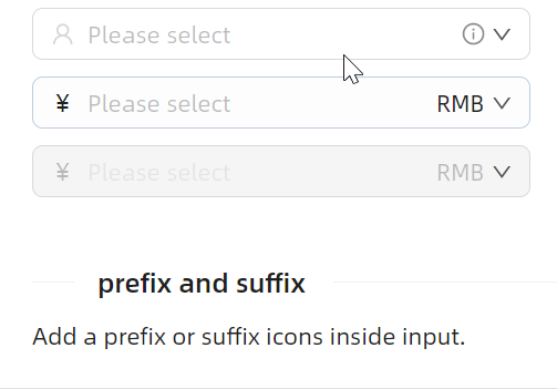
前缀/后缀
前后缀和前面刚展示过的Pre/Post Tab略不太一样,
InnerLeftContent则作为内部内容,位于输入框内部的左侧,是输入框的一部分。InnerRightContent则作为内部内容,位于输入框内部的右侧,是输入框的一部分。
InnerRightContent 与 RightAddOn 区别是:前者更趋向于为输入框内部的补充,而后者更趋向于为输入框外部的装饰。
<StackPanel Orientation="Vertical" Spacing="10">
    <atom:ComboBox PlaceholderText="Please select" Width="300"
                   InnerLeftContent="{atom:IconProvider Kind=UserOutlined, NormalFilledColor=#D7D7D7}"
                   InnerRightContent="{atom:IconProvider Kind=InfoCircleOutlined, NormalFilledColor=#8C8C8C}">
        <atom:ComboBoxItem>床前明月光</atom:ComboBoxItem>
        <atom:ComboBoxItem>疑是地上霜</atom:ComboBoxItem>
        <atom:ComboBoxItem>举头望明月</atom:ComboBoxItem>
        <atom:ComboBoxItem>低头思故乡</atom:ComboBoxItem>
    </atom:ComboBox>

    <atom:ComboBox PlaceholderText="Please select" Width="300"
                   InnerLeftContent="¥"
                   InnerRightContent="RMB">
        <atom:ComboBoxItem>床前明月光</atom:ComboBoxItem>
        <atom:ComboBoxItem>疑是地上霜</atom:ComboBoxItem>
        <atom:ComboBoxItem>举头望明月</atom:ComboBoxItem>
        <atom:ComboBoxItem>低头思故乡</atom:ComboBoxItem>
    </atom:ComboBox>

    <atom:ComboBox PlaceholderText="Please select" Width="300"
                   InnerLeftContent="¥"
                   InnerRightContent="RMB" IsEnabled="False">
        <atom:ComboBoxItem>床前明月光</atom:ComboBoxItem>
        <atom:ComboBoxItem>疑是地上霜</atom:ComboBoxItem>
        <atom:ComboBoxItem>举头望明月</atom:ComboBoxItem>
        <atom:ComboBoxItem>低头思故乡</atom:ComboBoxItem>
    </atom:ComboBox>

</StackPanel>
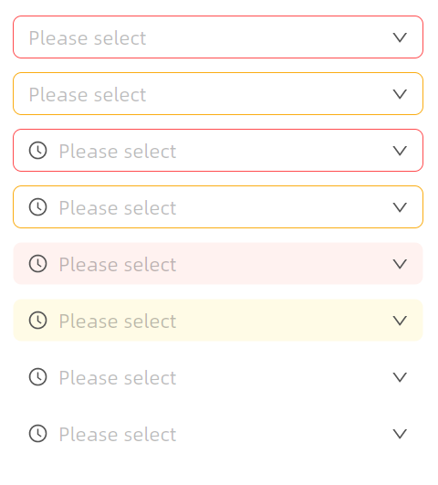
状态色
Status 属性可以一键设定组件的状态色,用于向用户传达一种明确的意图。可选值有Default、Error、Warning。
<StackPanel Orientation="Vertical" Spacing="10" Margin="0, 0, 20, 0">
    <atom:ComboBox PlaceholderText="Please select" Width="300"
                   Status="Error">
        <atom:ComboBoxItem>床前明月光</atom:ComboBoxItem>
        <atom:ComboBoxItem>疑是地上霜</atom:ComboBoxItem>
        <atom:ComboBoxItem>举头望明月</atom:ComboBoxItem>
        <atom:ComboBoxItem>低头思故乡</atom:ComboBoxItem>
    </atom:ComboBox>

    <atom:ComboBox PlaceholderText="Please select" Width="300"
                   Status="Warning">
        <atom:ComboBoxItem>床前明月光</atom:ComboBoxItem>
        <atom:ComboBoxItem>疑是地上霜</atom:ComboBoxItem>
        <atom:ComboBoxItem>举头望明月</atom:ComboBoxItem>
        <atom:ComboBoxItem>低头思故乡</atom:ComboBoxItem>
    </atom:ComboBox>

    <atom:ComboBox PlaceholderText="Please select" Width="300"
                   Status="Error"
                   InnerLeftContent="{atom:IconProvider Kind=ClockCircleOutlined}">
        <atom:ComboBoxItem>床前明月光</atom:ComboBoxItem>
        <atom:ComboBoxItem>疑是地上霜</atom:ComboBoxItem>
        <atom:ComboBoxItem>举头望明月</atom:ComboBoxItem>
        <atom:ComboBoxItem>低头思故乡</atom:ComboBoxItem>
    </atom:ComboBox>

    <atom:ComboBox PlaceholderText="Please select" Width="300"
                   Status="Warning"
                   InnerLeftContent="{atom:IconProvider Kind=ClockCircleOutlined}">
        <atom:ComboBoxItem>床前明月光</atom:ComboBoxItem>
        <atom:ComboBoxItem>疑是地上霜</atom:ComboBoxItem>
        <atom:ComboBoxItem>举头望明月</atom:ComboBoxItem>
        <atom:ComboBoxItem>低头思故乡</atom:ComboBoxItem>
    </atom:ComboBox>

    <atom:ComboBox PlaceholderText="Please select" Width="300"
                   Status="Error"
                   StyleVariant="Filled"
                   InnerLeftContent="{atom:IconProvider Kind=ClockCircleOutlined}">
        <atom:ComboBoxItem>床前明月光</atom:ComboBoxItem>
        <atom:ComboBoxItem>疑是地上霜</atom:ComboBoxItem>
        <atom:ComboBoxItem>举头望明月</atom:ComboBoxItem>
        <atom:ComboBoxItem>低头思故乡</atom:ComboBoxItem>
    </atom:ComboBox>

    <atom:ComboBox PlaceholderText="Please select" Width="300"
                   Status="Warning"
                   StyleVariant="Filled"
                   InnerLeftContent="{atom:IconProvider Kind=ClockCircleOutlined}">
        <atom:ComboBoxItem>床前明月光</atom:ComboBoxItem>
        <atom:ComboBoxItem>疑是地上霜</atom:ComboBoxItem>
        <atom:ComboBoxItem>举头望明月</atom:ComboBoxItem>
        <atom:ComboBoxItem>低头思故乡</atom:ComboBoxItem>
    </atom:ComboBox>

    <atom:ComboBox PlaceholderText="Please select" Width="300"
                   Status="Error"
                   StyleVariant="Borderless"
                   InnerLeftContent="{atom:IconProvider Kind=ClockCircleOutlined}">
        <atom:ComboBoxItem>床前明月光</atom:ComboBoxItem>
        <atom:ComboBoxItem>疑是地上霜</atom:ComboBoxItem>
        <atom:ComboBoxItem>举头望明月</atom:ComboBoxItem>
        <atom:ComboBoxItem>低头思故乡</atom:ComboBoxItem>
    </atom:ComboBox>

    <atom:ComboBox PlaceholderText="Please select" Width="300"
                   Status="Warning"
                   StyleVariant="Borderless"
                   InnerLeftContent="{atom:IconProvider Kind=ClockCircleOutlined}">
        <atom:ComboBoxItem>床前明月光</atom:ComboBoxItem>
        <atom:ComboBoxItem>疑是地上霜</atom:ComboBoxItem>
        <atom:ComboBoxItem>举头望明月</atom:ComboBoxItem>
        <atom:ComboBoxItem>低头思故乡</atom:ComboBoxItem>
    </atom:ComboBox>

</StackPanel>