
# 高级用法
Pre/Post Tab
这个示例中,为开发者演示组件的预置和后置内容,请重点关注如下属性:
LeftAddOn表示输入框左侧位置的Pre Tab,其值可以是一个图标,也可以是字符串。RightAddOn表示输入框右侧位置的Pre Tab,其值可以是一个图标,也可以是字符串。InnerRightContent则作为内部内容,位于输入框内部的右侧,是输入框的一部分。
InnerRightContent 与 RightAddOn 区别是:前者更趋向于为输入框内部的补充,而后者更趋向于为输入框外部的装饰。
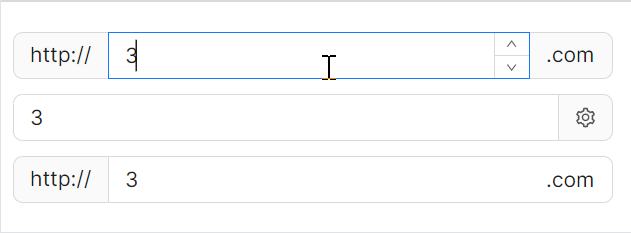
axaml文件:
<StackPanel Orientation="Vertical" Spacing="10">
    <atom:NumericUpDown LeftAddOn="http://" RightAddOn=".com" Width="400" HorizontalAlignment="Left"
                        Value="3" />
    <atom:NumericUpDown RightAddOn="{atom:IconProvider Kind=SettingOutlined}" Width="400"
                        HorizontalAlignment="Left"
                        Value="3" />
    <atom:NumericUpDown LeftAddOn="http://" InnerRightContent=".com" Width="400" HorizontalAlignment="Left"
                        Value="3" />
</StackPanel>
前后缀
这个示例是纯介绍 InnerRightContent 与 InnerLeftContent 的用法。
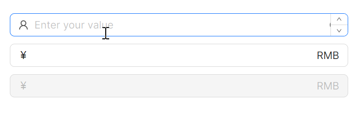
axaml文件:
<StackPanel Orientation="Vertical" Spacing="10">
    <atom:NumericUpDown Watermark="Enter your value"
                        InnerLeftContent="{atom:IconProvider Kind=UserOutlined, NormalFilledColor=#D7D7D7}"
                        InnerRightContent="{atom:IconProvider Kind=InfoCircleOutlined, NormalFilledColor=#8C8C8C}" />
    <atom:NumericUpDown InnerLeftContent="¥" InnerRightContent="RMB" />
    <atom:NumericUpDown InnerLeftContent="¥" InnerRightContent="RMB" IsEnabled="False" />
</StackPanel>
一键清理
在一些业务场景中,可以通过点击一个x号图标一键清理已输入的内容。下面的示例,就是结合设定 IsEnableClearButton 为True一键开启这个功能。
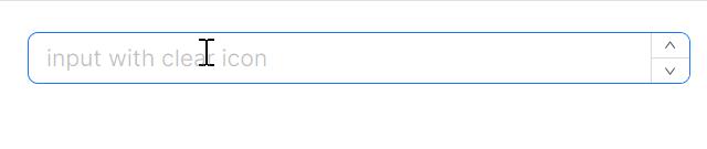
axaml文件:
<atom:NumericUpDown Watermark="input with clear icon" Width="400" HorizontalAlignment="Left"
                    IsEnableClearButton="True" />