
# 高级用法
自定义文案和图标
这个示例向大家展示如何控制组件的文案和图标,开发者需要关注如下属性:
OnContent:用于设定开启状态的文案,可以通过绑定atom:IconProvider来绑定图标。OffContent:用于设定关闭状态的文案,可以通过绑定atom:IconProvider来绑定图标。IsChecked:用于设定组件的初始状态。
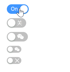
<StackPanel HorizontalAlignment="Left" Spacing="10" Orientation="Vertical">
    <atom:ToggleSwitch
        OnContent="On"
        OffContent="Off"
        IsChecked="True" />
    <atom:ToggleSwitch
        OnContent="开"
        OffContent="关" />
    <atom:ToggleSwitch
        OnContent="{atom:IconProvider Kind=TwitterOutlined}"
        OffContent="{atom:IconProvider Kind=WechatOutlined}"/>
    <atom:ToggleSwitch
        SizeType="Small"
        OnContent="{atom:IconProvider Kind=CheckOutlined}"
        OffContent="{atom:IconProvider Kind=WechatOutlined}"/>
    <atom:ToggleSwitch SizeType="Small">
        <atom:ToggleSwitch.OnContent>
            <atom:Icon IconInfo="{atom:IconInfoProvider Kind=CheckOutlined}" />
        </atom:ToggleSwitch.OnContent>
        <atom:ToggleSwitch.OffContent>
            <atom:Icon IconInfo="{atom:IconInfoProvider Kind=CloseOutlined}" />
        </atom:ToggleSwitch.OffContent>
    </atom:ToggleSwitch>
</StackPanel>
loading状态
在一些业务场景中,打开或关闭时同时需要一个“耗时”的同步过程,此时需要一个loading状态提供一个更好的操作体验。
下面这个示例展示如何设定loading状态,通过 atom:Button 组件来设定 atom:ToggleSwitch 组件的loading状态,本质上是通过操作 atom:ToggleSwitch 组件的 IsLoading 属性。
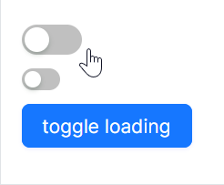
axaml文件:
<StackPanel HorizontalAlignment="Left" Spacing="10" Orientation="Vertical">
    <atom:ToggleSwitch IsLoading="True" IsChecked="true" x:Name="ToggleSwitchDefault" />
    <atom:ToggleSwitch SizeType="Small" IsLoading="True" x:Name="ToggleSwitchSmall" />
    <atom:Button ButtonType="Primary"
                 x:Name="ToggleLoadingStatusBtn"
                 Command="{Binding $parent[showCase:ToggleSwitchShowCase].ToggleLoadingStatus}"
                 CommandParameter="{Binding ElementName=ToggleLoadingStatusBtn}">
        toggle loading
    </atom:Button>
</StackPanel>
code-behind文件:
using System.Reactive;
using AtomUIGallery.ShowCases.ViewModels;
using Avalonia.Controls;
using Avalonia.ReactiveUI;
using ReactiveUI;
using Button = AtomUI.Controls.Button;
using ToggleSwitch = AtomUI.Controls.ToggleSwitch;

public partial class ToggleSwitchShowCase : ReactiveUserControl<ToggleSwitchViewModel>
{
    public ReactiveCommand<object, Unit> ToggleSwitchCommand { get; private set; }

    public ToggleSwitchShowCase()
    {
        this.WhenActivated(disposables => { });
        ToggleSwitchCommand = ReactiveCommand.Create<object, Unit>(o =>
        {
            ToggleDisabledStatus(o);
            return Unit.Default;
        });
        InitializeComponent();
    }

    public static void ToggleDisabledStatus(object arg)
    {
        var switchBtn = (arg as ToggleSwitch)!;
        switchBtn.IsEnabled = !switchBtn.IsEnabled;
    }

    public static void ToggleLoadingStatus(object arg)
    {
        var btn                 = (arg as Button)!;
        var stackPanel          = btn.Parent as StackPanel;
        var toggleSwitchDefault = stackPanel?.Children[0] as ToggleSwitch;
        var toggleSwitchSmall   = stackPanel?.Children[1] as ToggleSwitch;
        if (toggleSwitchDefault is not null)
        {
            toggleSwitchDefault.IsLoading = !toggleSwitchDefault.IsLoading;
        }

        if (toggleSwitchSmall is not null)
        {
            toggleSwitchSmall.IsLoading = !toggleSwitchSmall.IsLoading;
        }
    }
}