
# 快速入门
基础配置条件
- Nuget安装Avalonia
- Nuget安装AtomUI
基础用法
当一个选项被选择后,它的 IsChecked 属性会变成True。
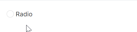
<atom:RadioButton>Radio</atom:RadioButton>
竖向
直接将 Orientation 属性设置为 Vertical 瞬间将横向单选变为竖向单选。
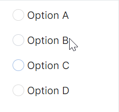
<StackPanel Orientation="Vertical" HorizontalAlignment="Left">
    <atom:RadioButton>Option A</atom:RadioButton>
    <atom:RadioButton>Option B</atom:RadioButton>
    <atom:RadioButton>Option C</atom:RadioButton>
    <atom:RadioButton>Option D</atom:RadioButton>
</StackPanel>
禁用
本质上就是设定 IsEnabled 属性的值。

<StackPanel HorizontalAlignment="Left" Orientation="Vertical">
    <StackPanel Orientation="Horizontal">
        <atom:RadioButton x:Name="ToggleDisabledRadioUnChecked">Radio1</atom:RadioButton>
        <atom:RadioButton x:Name="ToggleDisabledRadioChecked" IsChecked="True">Radio2</atom:RadioButton>
    </StackPanel>
    <atom:Button ButtonType="Primary"
                 x:Name="ToggleDisabledButton"
                 Margin="0, 20, 0, 0"
                 Command="{Binding $parent[showCase:RadioButtonShowCase].ToggleDisabledStatus}"
                 CommandParameter="{Binding ElementName=ToggleDisabledButton}">
        toggle disabled
    </atom:Button>
</StackPanel>
Radio组与图标
在现实业务场景中,多个单选框组成一个组且每个单选之间都是互斥的。同时,也可以为一个单选框组设置图标。
<WrapPanel Orientation="Horizontal" ItemSpacing="10">
    <atom:RadioButton>
        <StackPanel Spacing="5" Orientation="Vertical">
            <atom:Icon IconInfo="{atom:IconInfoProvider Kind=LineChartOutlined}"
                       Width="18"
                       Height="18"/>
            <TextBlock>LineChart</TextBlock>
        </StackPanel>
    </atom:RadioButton>
    <atom:RadioButton>
        <StackPanel Spacing="5" Orientation="Vertical">
            <atom:Icon IconInfo="{atom:IconInfoProvider Kind=DotChartOutlined}"
                       Width="18"
                       Height="18"/>
            <TextBlock>DotChart</TextBlock>
        </StackPanel>
    </atom:RadioButton>
    <atom:RadioButton>
        <StackPanel Spacing="5" Orientation="Vertical">
            <atom:Icon IconInfo="{atom:IconInfoProvider Kind=BarChartOutlined}"
                       Width="18"
                       Height="18"/>
            <TextBlock>BarChart</TextBlock>
        </StackPanel>
    </atom:RadioButton>
    <atom:RadioButton>
        <StackPanel Spacing="5" Orientation="Vertical">
            <atom:Icon IconInfo="{atom:IconInfoProvider Kind=PieChartOutlined}"
                       Width="18"
                       Height="18"/>
            <TextBlock>PieChart</TextBlock>
        </StackPanel>
    </atom:RadioButton>
</WrapPanel>