
# 遮罩Loading
atom:LoadingMaskHost 组件的典型用法主要用于在其他控件上显示加载状态。
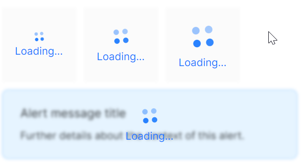
几个关键属性的作用:
- IsLoading: 控制加载状态的显示与隐藏。
- SizeType: 设置加载指示器的尺寸(Small/Middle/Large)。
- IsShowLoadingMsg: 控制是否显示加载文本。
- LoadingMsg: 设置加载时显示的文本内容。
axaml文件:
<StackPanel Orientation="Vertical" Spacing="10">
    <StackPanel Orientation="Horizontal" Spacing="10">
        <atom:LoadingMaskHost IsLoading="True" SizeType="Small"
                              IsShowLoadingMsg="True"
                              LoadingMsg="Loading...">
            <Border Width="100" Height="100" Background="rgb(251, 251, 251)" />
        </atom:LoadingMaskHost>
        <atom:LoadingMaskHost IsLoading="True" SizeType="Middle"
                              IsShowLoadingMsg="True"
                              LoadingMsg="Loading...">
            <Border Width="100" Height="100" Background="rgb(251, 251, 251)" />
        </atom:LoadingMaskHost>
        <atom:LoadingMaskHost IsLoading="True" SizeType="Large"
                              IsShowLoadingMsg="True"
                              LoadingMsg="Loading...">
            <Border Width="100" Height="100" Background="rgb(251, 251, 251)" />
        </atom:LoadingMaskHost>
    </StackPanel>
    <atom:LoadingMaskHost IsLoading="True"
                          IsShowLoadingMsg="True"
                          LoadingMsg="Loading...">
        <atom:Alert Message="Alert message title"
                    Description="Further details about the context of this alert."
                    Type="Info" />
    </atom:LoadingMaskHost>
</StackPanel>
下面这段示例是试图想开发者演示一个动态控制遮罩Loading业务场景。依然还是通过老面孔 atom:ToggleSwitch 来控制IsLoadingSwitchChecked的值进而影响 atom:LoadingMaskHost 的显示与隐藏。所以,开发者要做的就是在自己的业务逻辑种控制IsLoadingSwitchChecked的值即可。
axaml文件:
<StackPanel Orientation="Vertical" Spacing="10">
    <atom:LoadingMaskHost IsLoading="{Binding IsLoadingSwitchChecked}"
                          IsShowLoadingMsg="True"
                          LoadingMsg="Loading...">
        <atom:Alert Message="Alert message title"
                    Description="Further details about the context of this alert."
                    Type="Info" />
    </atom:LoadingMaskHost>
    <StackPanel Orientation="Horizontal" Spacing="10">
        <atom:TextBlock>Loading state:</atom:TextBlock>
        <atom:ToggleSwitch IsChecked="{Binding IsLoadingSwitchChecked}" />
    </StackPanel>
</StackPanel>
code-behind文件:
using AtomUIGallery.ShowCases.ViewModels;
using Avalonia.ReactiveUI;
using ReactiveUI;

public partial class LoadingIndicatorShowCase : ReactiveUserControl<LoadingIndicatorViewModel>
{

    public LoadingIndicatorShowCase()
    {
        this.WhenActivated(disposables => { });
        InitializeComponent();
    }
}
view-model文件:
using ReactiveUI;

public class LoadingIndicatorViewModel : ReactiveObject, IRoutableViewModel
{
    public const string ID = "LoadingIndicator";

    public IScreen HostScreen { get; }

    public string UrlPathSegment { get; } = ID;

    private bool _isLoadingSwitchChecked;

    public bool IsLoadingSwitchChecked
    {
        get => _isLoadingSwitchChecked;
        set => this.RaiseAndSetIfChanged(ref _isLoadingSwitchChecked, value);
    }

    public LoadingIndicatorViewModel(IScreen screen)
    {
        HostScreen = screen;
    }
}