
# 基础用法
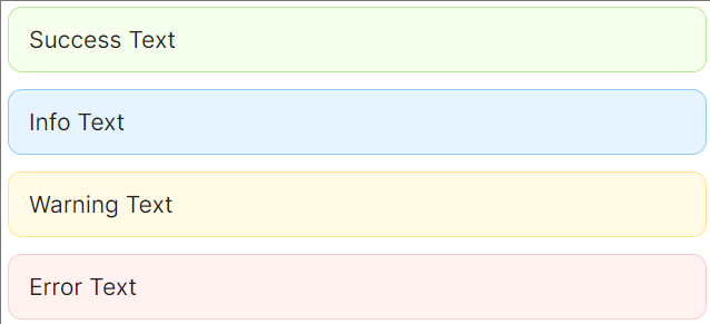
四种样式
Alert 组件提供了四种基础样式可供用户选择,分别对应 success 、 info 、 warning 、 error 。
<StackPanel>
    <atom:Alert Type="Success">Success Text</atom:Alert>
    <atom:Alert Type="Info">Info Text</atom:Alert>
    <atom:Alert Type="Warning">Warning Text</atom:Alert>
    <atom:Alert Type="Error">Error Text</atom:Alert>
</StackPanel>
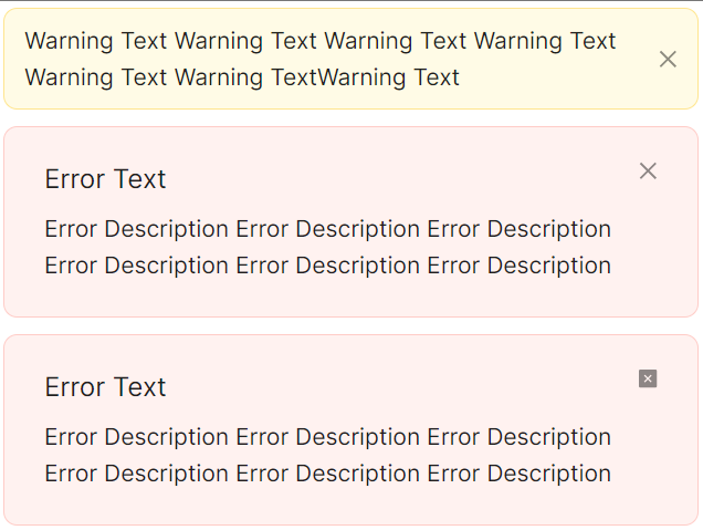
关闭按钮
如果允许用户关闭 Alert ,可以开启 Alert 的 IsClosable 选项。
<StackPanel>
    <atom:Alert Type="Warning" IsClosable="True">
        Warning Text Warning Text Warning Text Warning Text Warning Text Warning TextWarning Text
    </atom:Alert>
    <atom:Alert Type="Error" IsClosable="True"
                Description="Error Description Error Description Error Description Error Description Error Description Error Description">
        Error Text
    </atom:Alert>
    <atom:Alert Type="Error" IsClosable="True"
                Description="Error Description Error Description Error Description Error Description Error Description Error Description"
                CloseIcon="{atom:IconProvider CloseSquareFilled}">
        Error Text
    </atom:Alert>
</StackPanel>
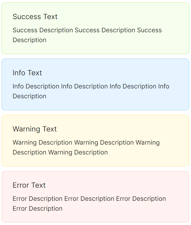
描述信息
需要对 Alert 进行详细描述时,可以开启 Description 特性。
<StackPanel Orientation="Vertical" Spacing="10">
    <atom:Alert Type="Success"
                Message="Success Text"
                Description="Success Description Success Description Success Description" />
    <atom:Alert Type="Info"
                Message="Info Text"
                Description="Info Description Info Description Info Description Info Description" />
    <atom:Alert Type="Warning"
                Message="Warning Text"
                Description="Warning Description Warning Description Warning Description Warning Description" />
    <atom:Alert Type="Error"
                Message="Error Text"
                Description="Error Description Error Description Error Description Error Description" />
</StackPanel>