
# 快速入门
基础配置条件
- Nuget安装Avalonia
- Nuget安装AtomUI
基础用法
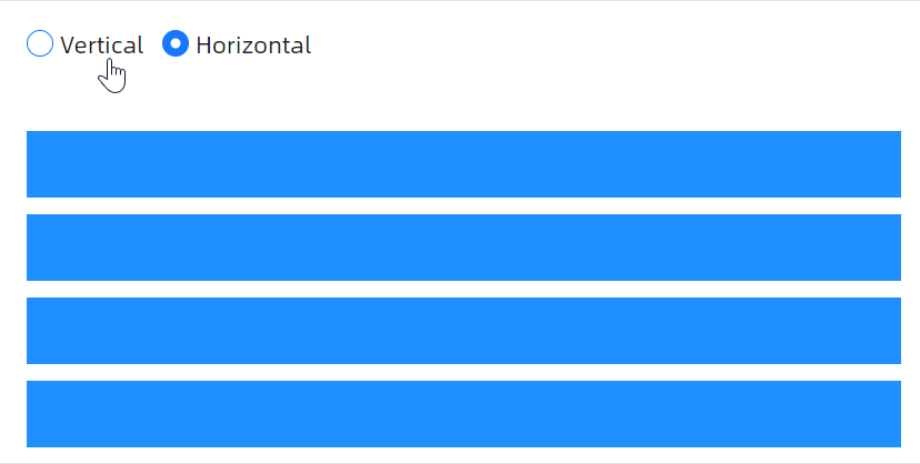
这个示例中通过顶部按钮改变 BoxPanel 的方向,本质上是通过 Orientation 属性来改变 BoxPanel 的方向,具体修改逻辑位于文档尾部code-behind文件中。
<StackPanel
    Margin="20"
    Orientation="Vertical"
    Spacing="20">

    <atom:BoxPanel Margin="0,0,0,20" Orientation="Horizontal" Spacing="10">
        <atom:RadioButton IsChecked="True" x:Name="Vertical">Vertical</atom:RadioButton>
        <atom:RadioButton x:Name="Horizontal">Horizontal</atom:RadioButton>
    </atom:BoxPanel>

    <Panel Height="200">
        <atom:BoxPanel
            Margin="0,0,0,10"
            Orientation="Vertical"
            Spacing="10"
            x:Name="BasicBoxPanel">
            <Panel Background="DodgerBlue" atom:BoxPanel.Flex="1" />
            <Panel Background="DodgerBlue" atom:BoxPanel.Flex="1" />
            <Panel Background="DodgerBlue" atom:BoxPanel.Flex="1" />
            <Panel Background="DodgerBlue" atom:BoxPanel.Flex="1" />
        </atom:BoxPanel>
    </Panel>
</StackPanel>
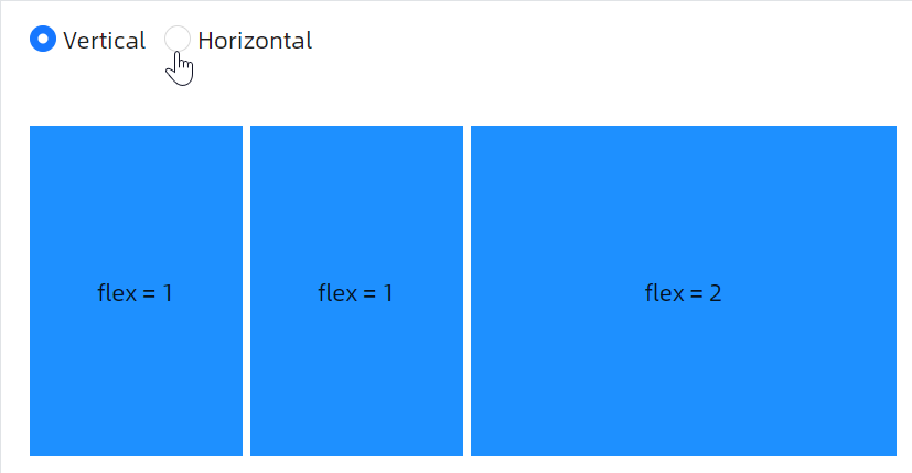
Flex布局
这个示例向开发者演示如何使用 Flex 布局,本质上是通过设定 atom:BoxPanel.Flex 属性的值来实现。
<StackPanel
    Margin="20"
    Orientation="Vertical"
    Spacing="20">

    <atom:BoxPanel Margin="0,0,0,20" Orientation="Horizontal" Spacing="10">
        <atom:RadioButton IsChecked="True" x:Name="Vertical1">Vertical</atom:RadioButton>
        <atom:RadioButton x:Name="Horizontal1">Horizontal</atom:RadioButton>
    </atom:BoxPanel>

    <atom:BoxPanel
        Height="200"
        Orientation="Horizontal"
        Spacing="5"
        x:Name="FlexBoxPanel">
        <Panel Background="DodgerBlue" atom:BoxPanel.Flex="1">
            <TextBlock TextAlignment="Center" VerticalAlignment="Center">
                flex = 1
            </TextBlock>
        </Panel>
        <Panel Background="DodgerBlue" atom:BoxPanel.Flex="1">
            <TextBlock TextAlignment="Center" VerticalAlignment="Center">
                flex = 1
            </TextBlock>
        </Panel>
        <Panel Background="DodgerBlue" atom:BoxPanel.Flex="2">
            <TextBlock TextAlignment="Center" VerticalAlignment="Center">
                flex = 2
            </TextBlock>
        </Panel>
    </atom:BoxPanel>
</StackPanel>
Child alignment
使用标准的 VerticalAlignment 属性控制子元素在交叉轴上的位置,支持Stretch、Top、Center、Bottom对齐方式;同时也可以混合布局,结合固定尺寸与 Flex 混合使用。

<StackPanel
    Margin="20"
    Orientation="Vertical"
    Spacing="20">

    <atom:BoxPanel
        Height="200"
        Orientation="Horizontal"
        Spacing="5">
        <Panel
            Background="DodgerBlue"
            Height="50"
            VerticalAlignment="Top">
            <Border Width="30" />
        </Panel>
        <Panel
            Background="DodgerBlue"
            Height="50"
            VerticalAlignment="Center">
            <Border Width="30" />
        </Panel>
        <Panel
            Background="DodgerBlue"
            Height="100"
            VerticalAlignment="Bottom"
            atom:BoxPanel.Flex="1" />
        <Panel Background="DodgerBlue" atom:BoxPanel.Flex="2" />
    </atom:BoxPanel>
</StackPanel>
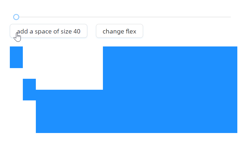
调整距离
这个示例中使用 Slider 控件控制 BoxPanel 的 Spacing 属性,本质上是使用 ValueChanged="HandleSpaceSliderValueChanged" 事件处理程序实现实时调整元素间距。
<StackPanel
    Margin="20"
    Orientation="Vertical"
    Spacing="20">

    <atom:VBoxPanel Orientation="Vertical">
        <atom:Slider
            IsEnabled="{Binding NormalEnabled}"
            Maximum="50"
            Minimum="0"
            TickFrequency="5"
            Value="10"
            ValueChanged="HandleSpaceSliderValueChanged"
            x:Name="SpaceSlider" />
        <atom:HBoxPanel Orientation="Horizontal" Spacing="20">
            <atom:Button Click="HandleAddSpaceButtonClicked" x:Name="AddSpaceButton">add a space of size 40</atom:Button>
            <atom:Button Click="HandleChangFlexButtonClicked" x:Name="ChangFlexButton">change flex</atom:Button>
        </atom:HBoxPanel>
    </atom:VBoxPanel>
    <atom:BoxPanel
        Height="200"
        Orientation="Horizontal"
        Spacing="5"
        x:Name="ChangeSpaceBoxPanel">
        <Panel
            Background="DodgerBlue"
            Height="50"
            VerticalAlignment="Top">
            <Border Width="30" />
        </Panel>
        <Panel
            Background="DodgerBlue"
            Height="50"
            VerticalAlignment="Center">
            <Border Width="30" />
        </Panel>
        <Panel
            Background="DodgerBlue"
            Height="100"
            VerticalAlignment="Bottom"
            atom:BoxPanel.Flex="1" />
        <Panel Background="DodgerBlue" atom:BoxPanel.Flex="2" />
    </atom:BoxPanel>
</StackPanel>
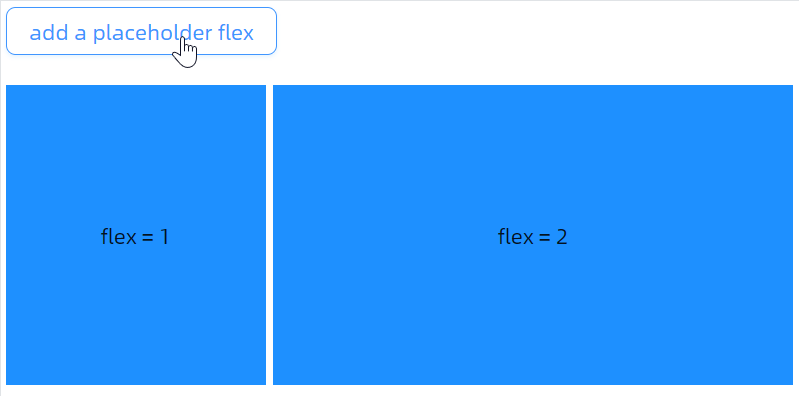
这个示例中通过触发 HandleAddFlexButtonClicked 事件动态向 BoxPanel 中添加新的弹性占位元素、Flex 占位符功能,除了一些业务场景中有类似需求,同时这种占位符可以做为一种辅助调试UI的手段。
<StackPanel
    Margin="20"
    Orientation="Vertical"
    Spacing="20">

    <WrapPanel>
        <atom:Button Click="HandleAddFlexButtonClicked" x:Name="AddFlexButton">add a placeholder flex</atom:Button>
    </WrapPanel>

    <atom:BoxPanel
        Height="200"
        Orientation="Horizontal"
        Spacing="5"
        x:Name="AddPlaceholderBoxPanel">
        <Panel Background="DodgerBlue" atom:BoxPanel.Flex="1">
            <TextBlock TextAlignment="Center" VerticalAlignment="Center">
                flex = 1
            </TextBlock>
        </Panel>
        <Panel Background="DodgerBlue" atom:BoxPanel.Flex="2">
            <TextBlock TextAlignment="Center" VerticalAlignment="Center">
                flex = 2
            </TextBlock>
        </Panel>
    </atom:BoxPanel>
</StackPanel>
公用文件
code-behind文件:
using AtomUI.Controls;
using AtomUIGallery.ShowCases.ViewModels;
using Avalonia.Controls.Primitives;
using Avalonia.Interactivity;
using Avalonia.Layout;
using Avalonia.ReactiveUI;
using ReactiveUI;

public partial class BoxPanelShowCase : ReactiveUserControl<BoxPanelViewModel>
{
    public BoxPanelShowCase()
    {
        this.WhenActivated(disposables => { });
        InitializeComponent();

        Vertical.IsCheckedChanged += HandleModeChecked;

        Horizontal.IsCheckedChanged += HandleModeChecked;

        Vertical1.IsCheckedChanged += HandleMode1Checked;

        Horizontal1.IsCheckedChanged += HandleMode1Checked;
    }


    private void HandleMode1Checked(object? sender, RoutedEventArgs e)
    {
        if (sender is RadioButton button)
        {
            if (button.Content?.ToString() == "Vertical")
            {
                FlexBoxPanel.Orientation = Orientation.Vertical;
            }
            else if (button.Content?.ToString() == "Horizontal")
            {
                FlexBoxPanel.Orientation = Orientation.Horizontal;
            }
        }
    }

    private void HandleModeChecked(object? sender, RoutedEventArgs e)
    {
        if (sender is RadioButton button)
        {
            if (button.Content?.ToString() == "Vertical")
            {
                BasicBoxPanel.Orientation = Orientation.Vertical;
            }
            else if (button.Content?.ToString() == "Horizontal")
            {
                BasicBoxPanel.Orientation = Orientation.Horizontal;
            }
        }
    }

    private void HandleSpaceSliderValueChanged(object? sender, RangeBaseValueChangedEventArgs e)
    {
        ChangeSpaceBoxPanel.Spacing = e.NewValue;
    }

    private void HandleAddSpaceButtonClicked(object? sender, RoutedEventArgs e)
    {
        if (e.Source is Button button && button.Content?.ToString() == "add a space of size 40")
        {
            ChangeSpaceBoxPanel.AddSpacing(40);
            AddSpaceButton.Content = "remove the space of size 40";
        }
        else
        {
            ChangeSpaceBoxPanel.Children.Remove(ChangeSpaceBoxPanel.Children[4]);
            AddSpaceButton.Content = "add a space of size 40";
        }
    }

    private void HandleChangFlexButtonClicked(object? sender, RoutedEventArgs e)
    {
            BoxPanel.SetFlex(ChangeSpaceBoxPanel.Children[3], BoxPanel.GetFlex(ChangeSpaceBoxPanel.Children[3]) == 1 ? 2 : 1);
    }

    private void HandleAddFlexButtonClicked(object? sender, RoutedEventArgs e)
    {
        if (e.Source is Button button && button.Content?.ToString() == "add a placeholder flex")
        {
            AddPlaceholderBoxPanel.AddFlex(1);
            AddFlexButton.Content = "remove the placeholder flex";
        }
        else
        {
            AddPlaceholderBoxPanel.Children.Remove(AddPlaceholderBoxPanel.Children[2]);
            AddFlexButton.Content = "add a placeholder flex";
        }
    }
}
view-model文件:
using ReactiveUI;

public class BoxPanelViewModel : ReactiveObject, IRoutableViewModel
{
    public const string ID = "BoxPanelShowCase";

    public IScreen HostScreen { get; }

    public string UrlPathSegment { get; } = ID;

    public BoxPanelViewModel(IScreen screen)
    {
        HostScreen = screen;
    }
}