
# Badge快速入门
基础配置条件
- Nuget安装Avalonia
- Nuget安装AtomUI
基础用法
最基础最小配置化的徽标组件功能,通过Border的 Width 与 Height 设定大小,通过 Count 属性设置数字,ShowZero 表示当数字为0时是否显示。
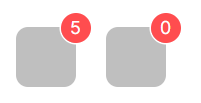
<StackPanel>
    <atom:CountBadge Count="5">
        <Border Width="40"
                Height="40"
                Background="rgb(191,191,191)"
                CornerRadius="8" />
    </atom:CountBadge>
    <atom:CountBadge Count="0" ShowZero="True">
        <Border Width="40"
                Height="40"
                Background="rgb(191,191,191)"
                CornerRadius="8" />
    </atom:CountBadge>
</StackPanel>
数字溢出设定
通过 OverflowCount 属性设置数字溢出显示的数字。
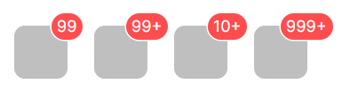
<StackPanel>
    <atom:CountBadge Count="99">
        <Border Width="40"
                Height="40"
                Background="rgb(191,191,191)"
                CornerRadius="8" />
    </atom:CountBadge>
    <atom:CountBadge Count="100">
        <Border Width="40"
                Height="40"
                Background="rgb(191,191,191)"
                CornerRadius="8" />
    </atom:CountBadge>
    <atom:CountBadge Count="99" OverflowCount="10">
        <Border Width="40"
                Height="40"
                Background="rgb(191,191,191)"
                CornerRadius="8" />
    </atom:CountBadge>
    <atom:CountBadge Count="1000" OverflowCount="999">
        <Border Width="40"
                Height="40"
                Background="rgb(191,191,191)"
                CornerRadius="8" />
    </atom:CountBadge>
</StackPanel>
数字角标偏移量
通过 Offset 属性设置数字角标偏移量。
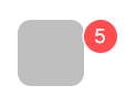
<StackPanel>
    <atom:CountBadge Count="5" Offset="10, 10">
        <Border Width="40"
                Height="40"
                Background="rgb(191,191,191)"
                CornerRadius="8" />
    </atom:CountBadge>
</StackPanel>
角标大小控制
通过 Size 属性设定数字角标大小。
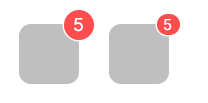
<StackPanel>
    <atom:CountBadge Count="5">
        <Border Width="40"
                Height="40"
                Background="rgb(191,191,191)"
                CornerRadius="8" />
    </atom:CountBadge>
    <atom:CountBadge Count="5" Size="Small">
        <Border Width="40"
                Height="40"
                Background="rgb(191,191,191)"
                CornerRadius="8" />
    </atom:CountBadge>
</StackPanel>