
# 快速入门
基础配置条件
- Nuget安装Avalonia
- Nuget安装AtomUI
基础用法

<atom:ToggleSwitch />
大小尺寸
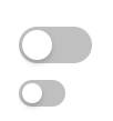
通过 SizeType 属性设定组件大小,一共提供了三种尺寸:Large、Middle、Small。
<StackPanel HorizontalAlignment="Left" Spacing="10" Orientation="Vertical">
    <atom:ToggleSwitch />
    <atom:ToggleSwitch SizeType="Small" />
</StackPanel>
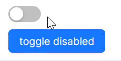
禁用
下面示例中,通过一个 atom:Button 组件控制 atom:ToggleSwitch 的禁用/启用状态。本质上是通过控制 IsEnabled 属性,详情参考code-behind文件。
axaml文件:
<StackPanel HorizontalAlignment="Left" Spacing="10" Orientation="Vertical">
    <atom:ToggleSwitch x:Name="ToggleDisabledSwitch" />
    <atom:Button ButtonType="Primary"
                 Command="{Binding $parent[showCase:ToggleSwitchShowCase].ToggleSwitchCommand}"
                 CommandParameter="{Binding ElementName=ToggleDisabledSwitch}"
                 >
        toggle disabled
    </atom:Button>
</StackPanel>
code-behind文件:
using System.Reactive;
using AtomUIGallery.ShowCases.ViewModels;
using Avalonia.Controls;
using Avalonia.ReactiveUI;
using ReactiveUI;
using Button = AtomUI.Controls.Button;
using ToggleSwitch = AtomUI.Controls.ToggleSwitch;

public partial class ToggleSwitchShowCase : ReactiveUserControl<ToggleSwitchViewModel>
{
    public ReactiveCommand<object, Unit> ToggleSwitchCommand { get; private set; }

    public ToggleSwitchShowCase()
    {
        this.WhenActivated(disposables => { });
        ToggleSwitchCommand = ReactiveCommand.Create<object, Unit>(o =>
        {
            ToggleDisabledStatus(o);
            return Unit.Default;
        });
        InitializeComponent();
    }

    public static void ToggleDisabledStatus(object arg)
    {
        var switchBtn = (arg as ToggleSwitch)!;
        switchBtn.IsEnabled = !switchBtn.IsEnabled;
    }

    public static void ToggleLoadingStatus(object arg)
    {
        var btn                 = (arg as Button)!;
        var stackPanel          = btn.Parent as StackPanel;
        var toggleSwitchDefault = stackPanel?.Children[0] as ToggleSwitch;
        var toggleSwitchSmall   = stackPanel?.Children[1] as ToggleSwitch;
        if (toggleSwitchDefault is not null)
        {
            toggleSwitchDefault.IsLoading = !toggleSwitchDefault.IsLoading;
        }

        if (toggleSwitchSmall is not null)
        {
            toggleSwitchSmall.IsLoading = !toggleSwitchSmall.IsLoading;
        }
    }
}